Punjabi Font Download for Gurmukhi and Punjabi Text
Punjabi writing is more than a script; it is memory, sound, and identity carried through Gurmukhi. Whether someone is preparing Gurbani text, creating Punjabi educational material, or simply typing Punjabi text for daily use, the right Punjabi font shapes how the language is read and felt. Searches for punjabi font download or punjabi font free download usually come from a practical need, but behind that need is something deeper: clarity, respect for the script, and visual harmony.
A gurmukhi font is not interchangeable with generic Indic scripts. Each curve, vowel sign, and spacing choice affects legibility. Main jab Punjabi text ke saath kaam karta hoon, I notice that people often install fonts without understanding their purpose. This page brings order to that confusion and helps you choose Punjabi fonts that truly serve your work.
What Makes a Gurmukhi Font Different
Gurmukhi was designed for clarity and collective reading. Unlike decorative scripts, it prioritizes flow across a line and balanced spacing between akhars. A proper punjabi font respects these principles while adapting to modern screens and printers.
Many punjabi fonts download collections include display fonts, handwritten styles, and text-optimized families. Each category serves a different use case. Using a decorative font for long Punjabi text quickly leads to fatigue, while using a body font for titles weakens visual impact.
A good gurmukhi font must balance three elements.
- Clear vowel differentiation for accurate reading
- Consistent stroke width for long passages
- Proper alignment with Gurmukhi matras
When these elements are missing, even fluent readers struggle.
Display Fonts vs Body Text Fonts
Understanding this difference saves time and frustration.
- Display fonts work best for headings, posters, and certificates
- Body text fonts are designed for paragraphs and books
- Handwritten fonts add personality but reduce speed
Yeh chhoti baat nahi hai. Font choice changes how Punjabi text feels on the page.
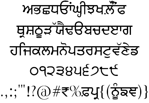
Punjabi Font Download Options and Families
Most users searching for punjabi fonts download encounter long lists without guidance. Fonts like Amar Lipi, Anmol Lipi, and Gurvetica are not just names; they are families with distinct personalities and technical goals.
Amar Lipi and Anmol Lipi families are widely used for modern Punjabi writing. They support international numerals while keeping classic Gurmukhi numbers available as symbols. This makes them practical for schools, newsletters, and everyday documents.
Other fonts focus on expression rather than neutrality.
- Bulara emphasizes bold display and hollow styles
- GHW Adhiapak mimics real handwritten Punjabi
- GHW Dukandar reflects informal shop-style shorthand
Each of these fonts answers a specific creative need. The mistake happens when one font is expected to do everything.
Fonts Optimized for Gurbani Text
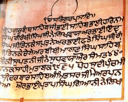
Gurbani typography has strict requirements. Line length, spacing, and akhar width matter deeply. Fonts such as Gurbani Akhar and Gurbani Lipi are designed to maintain traditional formatting, including the customary 19 lines per page layout.
For Gurbani work, random punjabi font free download choices often fail. Specialized gurmukhi font families exist for a reason.
Installing Punjabi Fonts Correctly
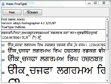
Installing a punjabi font is simple, yet many users face issues because steps are skipped. After a punjabi font download, the file usually ends in .TTF. Installation differs slightly across systems, but the principle remains the same.
For Windows systems, the standard approach works reliably.
- Download the Punjabi font file to your computer
- Right-click the .TTF file and choose Install
- Open the Fonts folder to confirm installation
Once installed, the font becomes available in all compatible software. If Punjabi text still appears broken, the issue is often not the font but the keyboard layout or keymap.
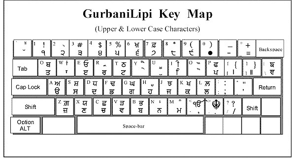
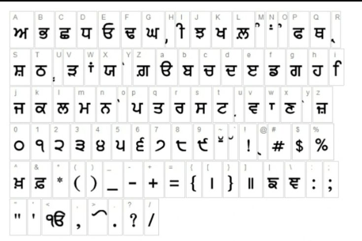
Why Keymaps Matter
Most Gurmukhi fonts rely on a specific keymap. Typing without the correct mapping leads to incorrect characters. This is where users often assume the font is faulty.
A proper setup requires:
- Matching the font with its keymap
- Using a compatible Punjabi keyboard layout
- Testing with basic Punjabi text before long typing
Bina keymap samjhe kaam karna unnecessary frustration create karta hai.
Choosing the Right Punjabi Font for Your Use
Font selection should begin with a clear question: what is this Punjabi text for? A poster, a book, a website, or Gurbani printing all demand different answers.
Below is a practical comparison to guide selection.
| Use Case | Recommended Font Type | Reason |
| Long Punjabi text | Gurvetica, Raajaa | High readability |
| Gurbani formatting | Gurbani Akhar, Gurbani Lipi | Traditional layout |
| Titles and posters | Bulara, Lanma | Strong visual impact |
| Handwritten style | GHW Adhiapak, Prabhki | Natural feel |
This table simplifies decision-making without reducing choice.
Punjabi Text in Digital and Print Spaces
Punjabi text today moves between screens and paper. A font that looks perfect on print may feel heavy on mobile. Web-specific fonts like Web Akhar Slim and Web Akhar Thick were created to solve this issue.

For digital platforms, font weight and hinting matter as much as style. Thin fonts save space but can break at small sizes. Thick fonts improve contrast but reduce elegance if overused.
Have you ever noticed how the same Punjabi text feels different on a phone compared to a printed page? That difference comes down to font engineering, not language.
Free Punjabi Font Downloads and Ethical Use
Many users look specifically for punjabi font free download options. Free access helps language spread, but it also carries responsibility. Fonts created by designers reflect years of cultural and technical work.
Using free Punjabi fonts respectfully means:
- Avoiding misuse in distorted contexts
- Preserving original character integrity
- Choosing appropriate fonts for sacred text
Language thrives when tools are used with care, not speed.
Handwritten and Informal Gurmukhi Fonts in Daily Use
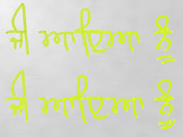
Handwritten Punjabi fonts serve a different emotional purpose than neutral body text fonts. They imitate the flow of pen on paper and bring warmth to Punjabi text that would otherwise feel mechanical. Fonts such as GHW Adhiapak, GHW Dukandar, Raaj, and Raajaa reflect real-life writing styles seen in classrooms, shops, and personal notes across Punjab.
These fonts are often chosen for:
- Classroom worksheets and learning material
- Informal posters and community notices
- Creative Punjabi text projects
The visual irregularity is intentional. It mirrors human writing, not print perfection. Lekin yeh yaad rakhna zaroori hai ki handwritten fonts slow down reading speed when used for long paragraphs.
When Handwritten Fonts Work Best
They perform best in limited contexts.
- Short headings and captions
- Personal letters and notes
- Design-heavy visuals
For books, articles, or Gurbani passages, handwritten styles reduce clarity and should be avoided.
Display Fonts and Visual Identity in Punjabi Text
Display-oriented Punjabi fonts exist to command attention. Fonts like Bulara, Lanma, Magaz, and Rupe focus on shape impact rather than silent readability. They are ideal for banners, certificates, covers, and social media graphics.
A display font changes how Punjabi text speaks visually. Thick strokes suggest strength. Slim, elongated tails suggest elegance. But misuse creates visual noise.
Effective use follows simple discipline.
- Use display fonts only for short text
- Pair them with clean body fonts
- Maintain consistent font identity
Visual identity matters more in Punjabi text than many assume because the script itself carries rhythm.
Punjabi Fonts for Education and Learning
Educational material requires patience from the reader. Fonts such as Gurvetica A and Raajaa were developed with this in mind. Special care is taken to differentiate vowels clearly, helping learners and readers with weak eyesight.
For schools and teaching material, a good gurmukhi font should offer:
- Clear vowel distinction
- Balanced line spacing
- Neutral, distraction-free shapes
In my field observations, students read faster and retain more when Punjabi text is printed in stable, uncluttered fonts. A simple font quietly supports learning.
Common Issues After Punjabi Font Installation
Many users install a punjabi font download correctly yet face problems when typing. The issue usually lies in software settings rather than the font itself.
Typical issues include:
- Characters appearing in wrong order
- Missing matras or broken akhars
- English letters showing instead of Punjabi text
These problems usually trace back to keyboard layout mismatches or unsupported software environments. Testing fonts in basic text editors before advanced design software saves time.
Simple Troubleshooting Steps
If Punjabi text looks incorrect:
- Check that the correct keyboard layout is active
- Confirm the font’s keymap compatibility
- Restart the application after installation
Chhoti si checking kaafi problems solve kar deti hai.
Punjabi Fonts for Web and Online Content
Web-based Punjabi text demands different technical priorities. Fonts must load fast, scale well, and remain legible on small screens. Web Akhar Slim and Web Akhar Thick exist specifically for this purpose.
Online Punjabi content benefits from:
- Strong contrast at small sizes
- Clean vertical alignment
- Minimal decorative complexity
Choosing a heavy decorative punjabi font for web paragraphs often drives readers away. Web fonts should disappear into the reading experience, not dominate it.
Respecting Gurmukhi in Sacred and Cultural Contexts
Gurmukhi is inseparable from Sikh spiritual life. When Punjabi text carries Gurbani or references to Sikh history, font choice becomes an ethical decision. Specialized fonts such as Gurbani Akhar and Gurbani Lipi were created to honor traditional layout and reading practices.
Using random punjabi fonts download packages for sacred text risks visual distortion and loss of discipline. Respect shows in details: spacing, alignment, and consistency.
Ask yourself honestly: does this font serve the message, or does it decorate it?
Building a Personal Punjabi Font Library
Over time, most serious users build a small, reliable collection rather than relying on dozens of fonts. A balanced Punjabi font library usually includes:
- One strong body text font
- One Gurbani-optimized font
- One handwritten or display font
This approach keeps work consistent and reduces confusion when switching between projects. Punjabi text gains strength through continuity, not excess choice.
Punjabi Fonts as Cultural Infrastructure
Fonts are silent infrastructure. They carry language across screens, pages, and generations. When someone searches for punjabi font free download or gurmukhi font, they are often trying to bridge tradition with daily digital life.
The right Punjabi font does not call attention to itself. It lets words speak clearly, respectfully, and with confidence. That is where typography meets cultural responsibility.
If language is living memory, then fonts are its vessels. How carefully we choose them shapes how Punjabi text survives tomorrow.